Dental Made Easy Rebranding
Brooklyn Dental Identity
Identity Design (website, business cards, signage)
![]()
![]()
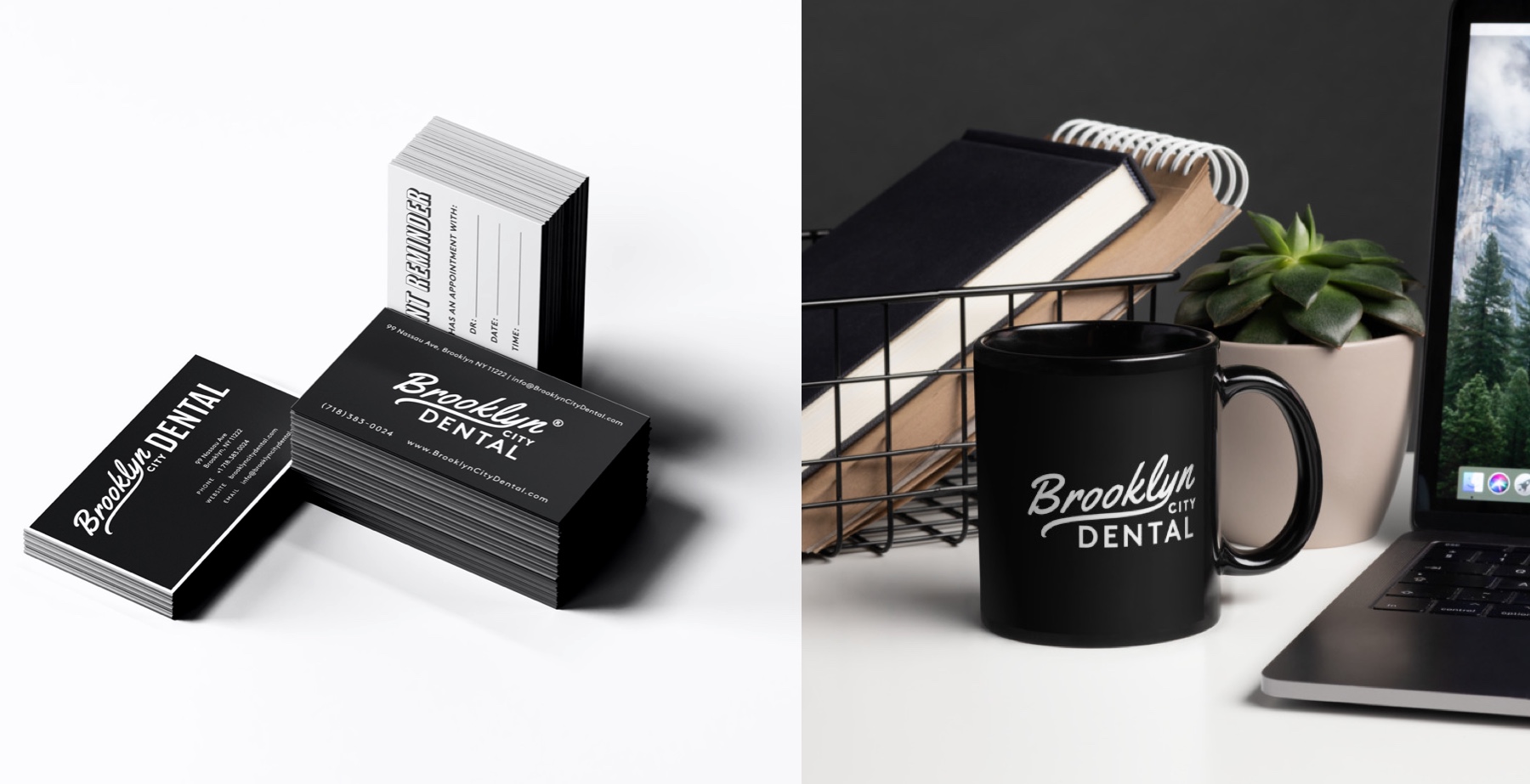
Brooklyn City Dental is a modern full-service dental office located in the heart of Greenpoin, Brooklyn. The rebrand provided an identity upgrade that embraces its Brooklyn roots, taking cues from its history and vernacular.
Role: Logo, website and identity design
Year: 2019
Client: Brooklyn City Dnetal (Dental Made Easy)
Year: 2019
Client: Brooklyn City Dnetal (Dental Made Easy)

Dental Made Easy Rebranding
Brooklyn Dental Identity
Identity Design (website, logo, signage)
Role:
Wordmark, website, & signage
Wordmark, website, & signage
Client:
Brooklyn City Dental
Brooklyn City Dental
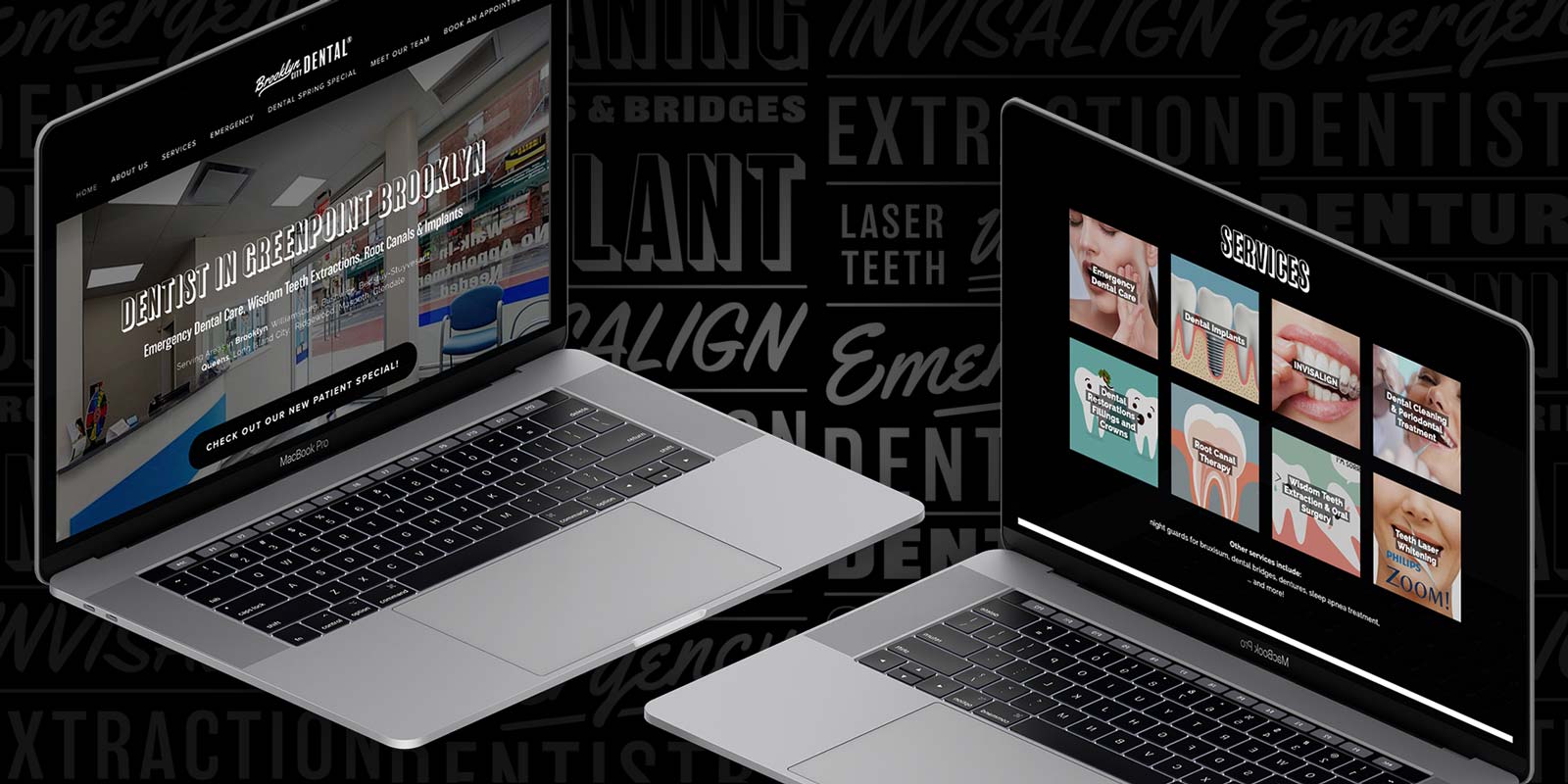
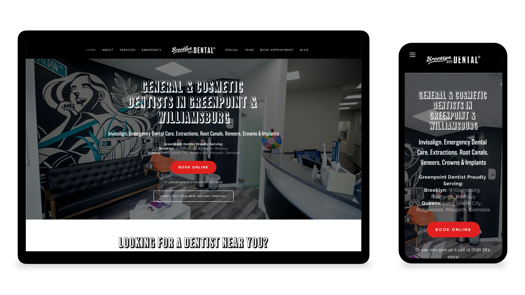
After leaving behind its baby blue scrubs and Dental Made Easy moniker, Brooklyn City Dental wanted to tell a different story, one that a felt like part of its neighborhood in Greenpoint, Brooklyn.
I was brought in to develop the brand and a visual system to bring this to life. I partnered closely with the owners to develop a brand new wordmark, dynamic, energetic and retro signage to call out its Brooklyn roots and youthful demographic.

Bold graphic mural and typography inspired by bold, handcrafted vernacular of old sports paraphanelia.
Signage & Lightbox