Samoset Family Dental Website Design
Website That Builds Trust
Branding, User Experience & Web Design

More than one in five (21.3%) patients said that they had not visited the dentist in the last few years. Dental anxiety and lack of dental knowledge remain persistent barriers in preventing patients from taking better care of their dental health.
Our goal with this website is to address common pain points facing new and returning patients and create a helpful, user friendly digital intermediary between dentist and patient.
Our goal with this website is to address common pain points facing new and returning patients and create a helpful, user friendly digital intermediary between dentist and patient.
Year: 2016-2017
Tools: User Research, Wireframes, Brand Identity
PROJECT GOAL
Make the first visit to the dentist convenient, transparent and anxiety-free.
Reducing Patient Anxiety
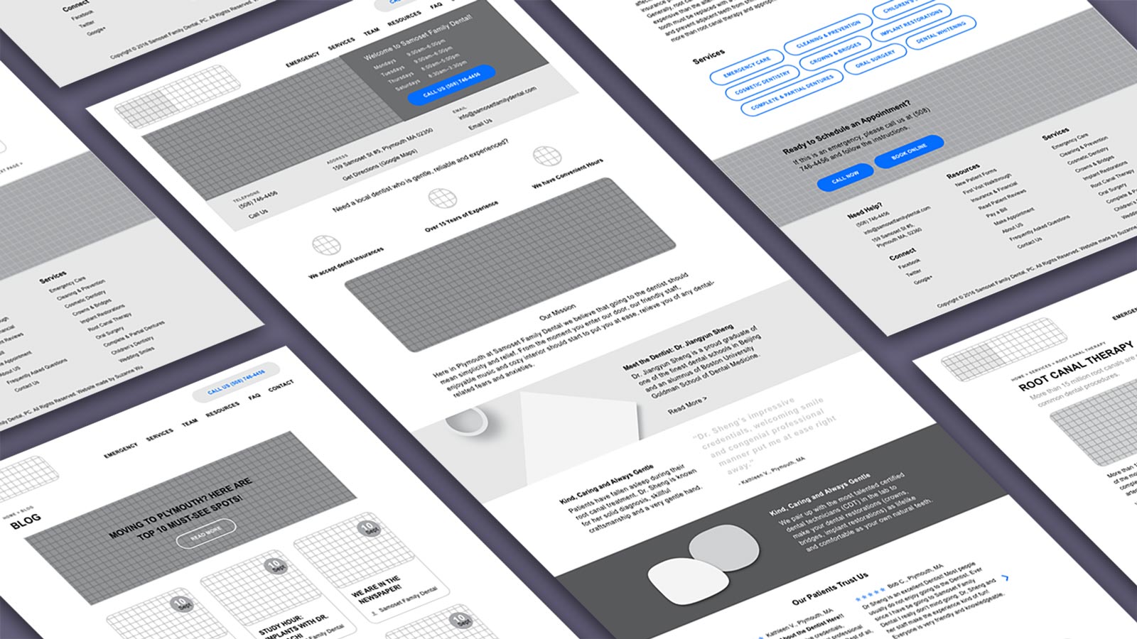
To address a patient’s fear of visiting a new dental office I created a dedicated First Visit Walkthrough page. It illustrates to patients step-by-step what they can expect even before they walk into the office.
I also used staff photos, patient testimonials, awards and accreditations and friendly copywriting, to both create an emotional connection and convey trustworthiness.
I also used staff photos, patient testimonials, awards and accreditations and friendly copywriting, to both create an emotional connection and convey trustworthiness.

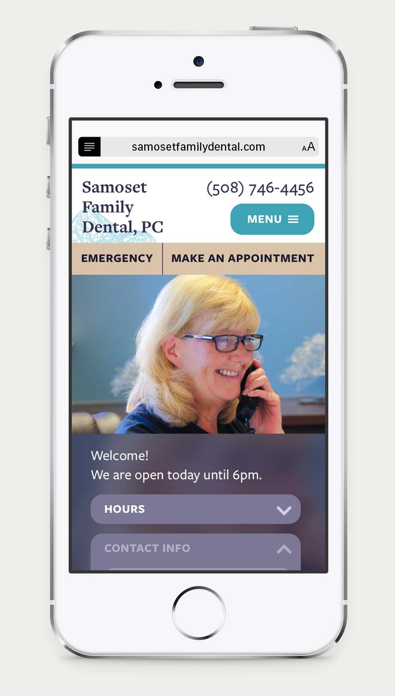
Our hours and contact info in moved front and center on the homepage.

At the bottom of each page there is an appointment CTA.
ROLE
Responsive Design

More and more patients make key healthcare decisions on mobile - I made the mobile experience a key focus during the design process by making it easy for users to achieve their key goals of assessing our credibility and making appointments.

BRANDING + VISUAL DESIGN

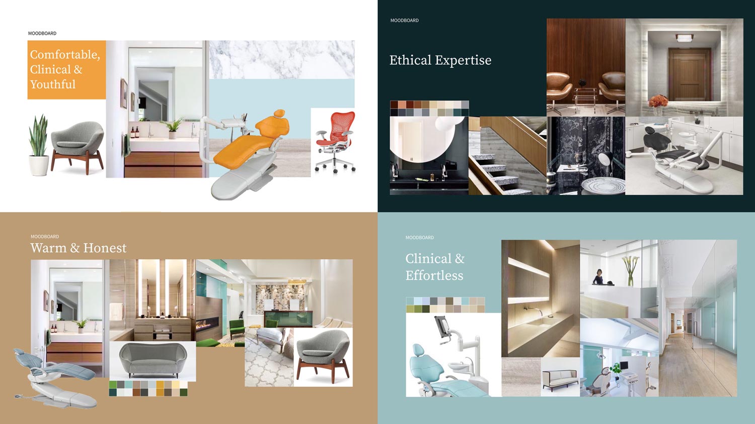
Moodboard reflecting the key brand qualities
The colors scheme includes natural and refreshing tones inspired by Plymouth itself with shades like warm burnt umber balanced with a soothing sea green. The office is outfitted with natural materials like wood, cotton and ceramic and gentle fragrances to counter the sterility of a dental office.
For the typefaces I chose Freight suite from Darden Studios in order to utilize its wide variants of display, serif and sans serif typefaces across all possible usages and contexts. The serif Freight Text fits the formality of the print collaterals while the Freight Sans reads friendlier on the web.
All parts of the branding work to reinforce the feeling of a gentle, effortless, quality experience.

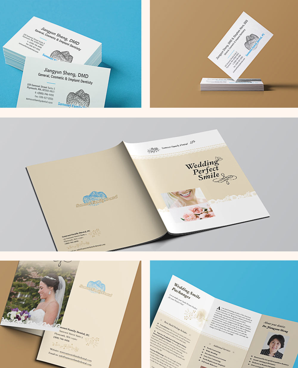
Printed Branding and Marketing Materials
